How to Pick the Right Running Route in Paris: A Five-Variable Framework
Distance and elevation are the easy variables. Surface, traffic, shade and intersections matter just as much. A runner's framework for picking the right route every time.
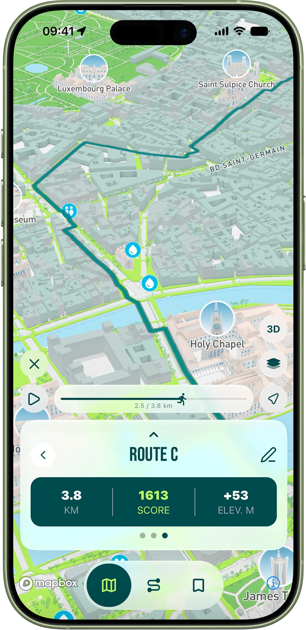
Most route generators stop at distance and elevation. They will tell you how far you are running and how much you are climbing, and they will leave it at that. The problem is that in a dense city these two variables predict maybe twenty percent of how a run actually feels. The other eighty percent comes from things almost no one measures: how wide the sidewalk is, how many traffic lights you will hit, how much of the route is shaded, whether the surface is consistent, whether you can hold pace without interruption. We built RunninParis around scoring those variables for every street in Paris, and after a few thousand test runs across the city the framework is stable enough to share. Use it whether you use the app or not — knowing what to look for in a route changes how you read a map.
The framework has five variables. They are listed below in roughly the order they matter, though the right ordering depends on what kind of run you are doing. The point is not to rank them once and forget; the point is to understand what each variable contributes so you can deliberately match the route to the workout.
The five variables that determine a route's quality
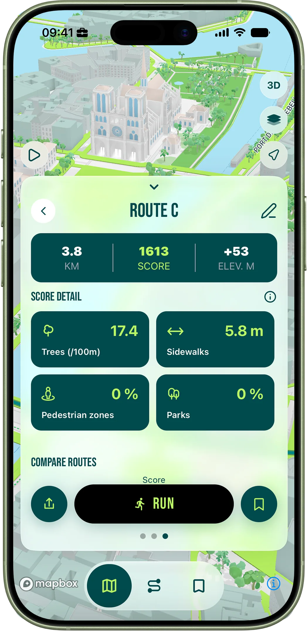
The first variable is sidewalk width. This is the foundation, the one that most predicts whether you will enjoy the run before any of the others apply. Below 1.8 metres of effective width, you spend the run dodging pedestrians and street furniture; everything else becomes irrelevant. Between 1.8 and 2.5 metres, you can run but you cannot stop thinking about the line you are holding. Above 2.5 metres, the sidewalk becomes a real running surface and your brain releases the bandwidth it was spending on micro-adjustment. The neurological cost of constant adjustment is the reason a five-kilometre run on narrow sidewalks feels more tiring than an eight-kilometre run on wide ones at the same pace. The city of Paris publishes the width of every sidewalk segment as open data; we use it as the baseline of every street's score, which means wider sidewalks mathematically pull the algorithm toward them.
The second and third variables are parks and pedestrian zones. Both are categorical multipliers rather than gradient measurements: a street segment either is or is not inside a park, either is or is not a pedestrian zone. When applied, they overrule almost everything else. A route that runs 30 percent of its distance through pedestrian zones feels meaningfully easier than a route with zero percent, at identical total distance and pace, because the absence of intersections and traffic decisions reduces cognitive load. The Seine quays, the Bois de Boulogne, the Bois de Vincennes, the Promenade Plantée, the inner parks, the rue Cler, the rue Montorgueil — these are the parts of the city where the score multipliers stack the highest. A route that touches two or three of them will outscore an otherwise comparable route every time.
The fourth variable is tree density. This sounds soft and aesthetic but it is the variable that disproportionately matters in summer and at midday. Trees provide shade, lower the perceived effort and reduce air temperature along the run by two or three degrees compared with bare boulevards. Paris has more than 200,000 trees mapped by the city — that is denser than London or Berlin but considerably less dense than the most leafy American cities. Within Paris the variation street-by-street is huge. The avenue Foch has tree cover so dense that summer afternoons stay comfortable; the rue de Rivoli has almost none and bakes. The dataset is good enough that the app can route you specifically along the leafy streets even when the leafy streets are not the shortest path. In July this is the difference between a tolerable run and a great one.
The fifth variable is the number of intersections per kilometre. This is the silent killer of pace and the silent multiplier of mental load. A flat five-kilometre route with twenty-five traffic lights is harder than a hilly seven-kilometre route with five. Routes that cluster their intersections at the start and end and offer a long uninterrupted middle stretch feel longer in a good way; routes that scatter intersections throughout feel shorter in a bad way, because you never settle in. The OpenStreetMap data we use lets us count intersections precisely for any candidate route, and the algorithm penalizes intersection density just below sidewalk width as an input. Most users do not look at the intersections explicitly, but if you ask why one of two seemingly identical routes scored higher, this is usually the answer.
How to actually read a route's score
Two routes that score identically on the total can have completely different compositions, and the composition is what determines what kind of run they produce. A route that scores 1100 because it is full of parks and pedestrian zones is fundamentally a different experience from one that scores 1100 because the sidewalks are wide everywhere. The first is an experience run — you finish it feeling restored, the city showed off. The second is a workout run — you can hit pace targets, hold tempo, do strides if you want. Match the route type to the workout you actually planned. Easy days and recovery days deserve experience routes; tempo days, threshold days and intervals deserve workout routes. The fastest way to learn this is to do two identical-distance runs on the same day, once on each type, and notice how different they feel. After two or three of those comparisons the score breakdown starts to mean something concrete to you rather than being an abstract number.
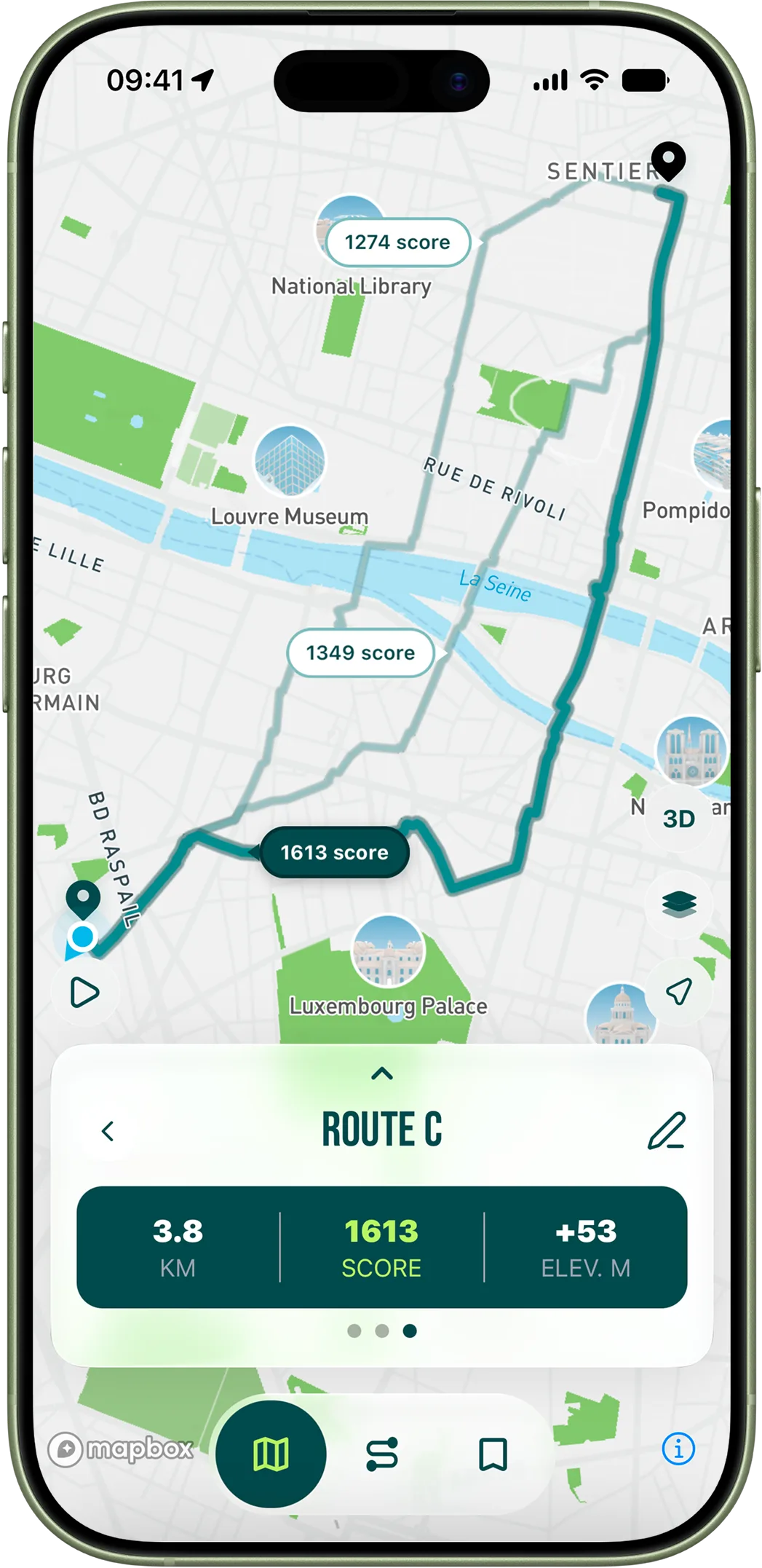
The other thing to read is the variance between the candidate routes that the app generates from the same input. When the algorithm proposes three routes from the same starting point at the same distance, look at how different they are from each other on each variable. If all three are dominated by sidewalk width and have almost no parks or pedestrian zones, you are in an area of the city where there are no good options at that distance — you might want to shorten or lengthen the request to get the algorithm into a better neighbourhood. If one route is mostly parks and the other two are mostly boulevards, you have a real choice to make. The app will not pick for you; it will show you the choice clearly.
Loop or itinerary — they are not interchangeable
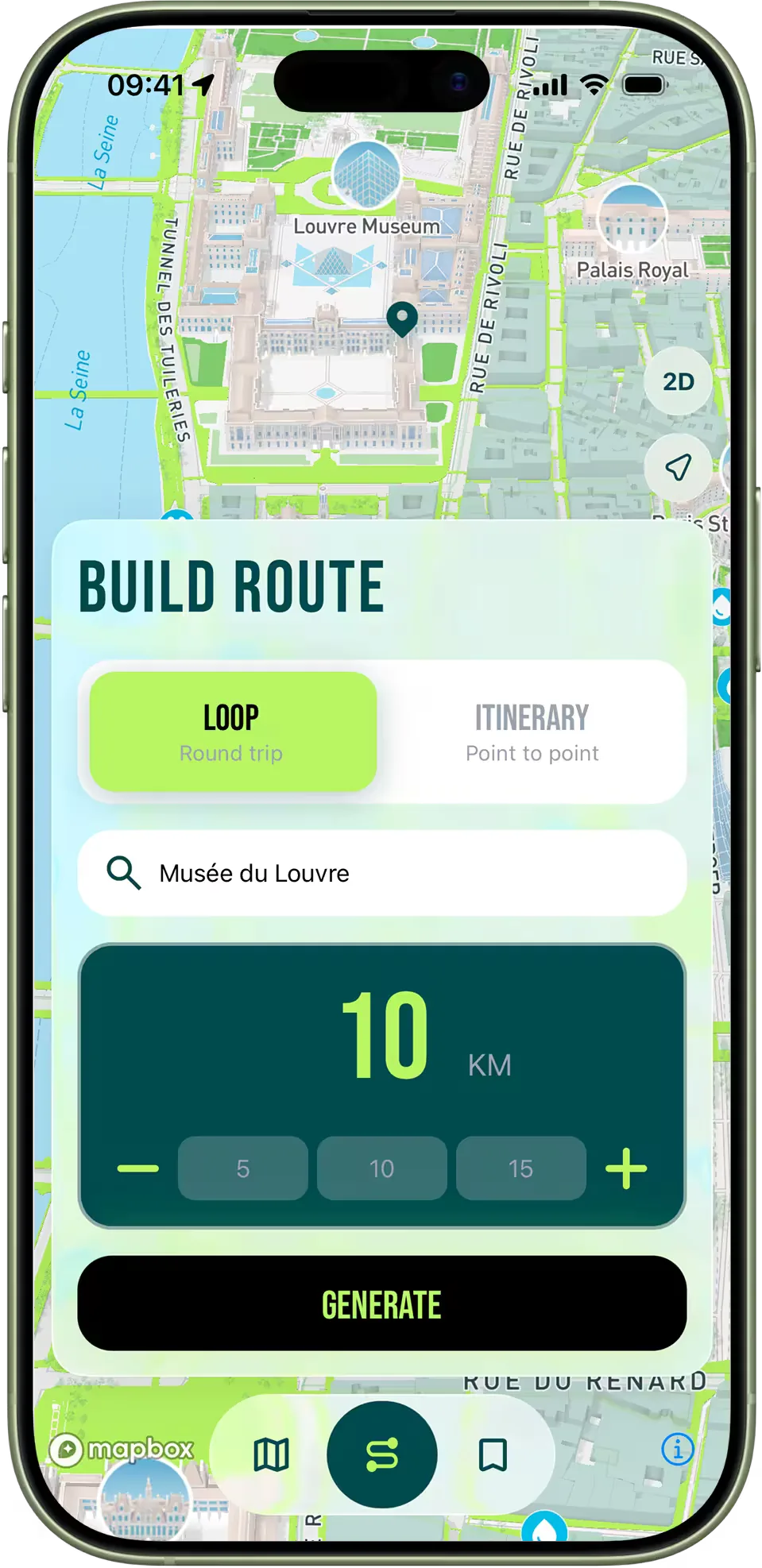
The mode you pick changes what the algorithm can optimize for. Loop mode means you start and finish at the same address, which is the right default for daily training because you are starting from home and you need to end up back there. Itinerary mode means start at one point and end at another, which is the right default for run-commutes and one-way distance challenges where you can take the Métro back. The two modes produce meaningfully different routes from the same input distance, because itinerary gives the algorithm more flexibility. A loop has to come back to its start, which constrains where it can go; an itinerary can wander, which means it can find higher-scoring sequences that the loop algorithm would not consider. If you have never run with itinerary mode, try this: pick an endpoint four to six kilometres from your home, ideally near a Métro station, and let the algorithm route you there. The result will surprise you.
The takeaway, after all of this, is a simple practice you can apply on every run. Generate three options. Ignore the total score for a moment. Look at the breakdown — which route is dominated by parks, which by pedestrian zones, which by sidewalk width. Decide what kind of run you actually want today. Pick the route whose composition matches that intent. After a month, you will stop needing the breakdown explicitly because you will have internalized the framework. The app is just the training wheels for becoming a better reader of the city.